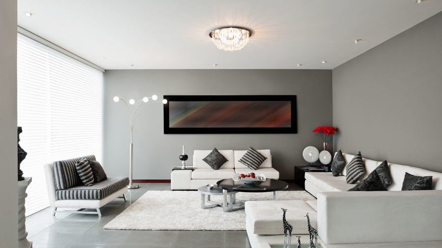
Decorating your home is a very personal thing — we all have different tastes. There are some common design mistakes, however, that many of us make. The good news is that even if you’re guilty of one or more of these faux pas, they’re easy to fix.
Pushing all the furniture against the wall
People seem to think that if you push everything to the four walls, there will be more room in the middle. What are they making room for — a dance floor?
The fix: Move furniture away from the walls, and arrange the pieces together to encourage conversations. If as a result, say, a sofa or chair seems to float in the middle of the room, anchor it with a console or side table.
Poor lighting
Even a well-appointed room can look dreary when there’s not enough light. Just as bad is a room lit by one super-bright overhead lamp that reveals every fine line on our faces.
The fix: Try to have three sources of light in each room at different heights and diffuse each with shades so that the light is soft and flattering. Also, use dimmer switches so you can vary the mood.
Not planning ahead
Don’t fall into the trap of falling in love with a piece of furniture in the store, but finding that it’s too big for the room when it’s delivered.
The fix: The next time you consider new furniture, take measurements of your room first, and draw a diagram of your room layout on graph paper, with each square representing a square foot. Use the graph paper to help you plan how different furniture pieces will fit — before you buy them
Being too matchy-matchy
Don’t buy sofas, loveseats and armchairs in matching sets. Ditto for bedroom sets with matching dressers and nightstands. Your home is not a Sears showroom.
The fix: Incorporate pieces that coordinate with each other, rather than match exactly. Also, feel free to mix up wood finishes in the same room. They don’t all need to be the same shade of brown.
Looking like a catalog
Some rooms are almost too perfect, like they’re straight out of a catalog. The result is a sterile environment that doesn’t reflect your own personality.
The fix: Go ahead and order from catalogs. Just be sure to include furniture pieces and/or accessories that have a backstory and special meaning to you.
An over-reliance on white walls
Unless your home is a sleek, modern work of architecture that looks like a gallery, white walls are boring. Colored walls add warmth and provide a more pleasing backdrop for your furniture and accessories.
The fix: If you’re afraid of colors, go with neutrals. Even a light tan is preferable to white. My secret weapon for color-phobic clients is the Restoration Hardware paint fan deck. Every color is a soothing neutral.
Over-accessorizing
If you’ve ever sat on a sofa or gotten into a bed with too many throw pillows, you know there can be such a thing as too many accessories. The same goes for too many picture frames, candles and other tchotchkes, which make your home look cluttered.
The fix: Remove half of your accessories and see how the room breathes. Put the extras in storage, and rotate your accessories every few months so it always feels like there’s something new.
Hanging art too high
In almost every home, there is at least one picture that is hung too high. Artwork that is higher than eye level feels disconnected from the rest of the room.
The fix: Position your framed art so that the center of it, measured vertically, is between 57 and 60 inches from the floor. That’s eye level for the average person who’s not a basketball player.
Hanging curtains too low
The tendency for most people is to hang curtain rods right above the window frame. Doing so makes the windows look shorter and the ceilings lower.
The fix: Install the curtain rod as high as you can, right below the ceiling level, assuming you have a standard 8-foot ceiling. (Vaulted ceilings are a whole other discussion.) Higher curtains draw the eye up, making the room look more expansive.
Forgetting about the ceiling
Poor ceilings. They are typically an afterthought, or worse, just ignored. Having a white, unadorned ceiling can be jarring, especially when the rest of the room is drenched in color.
The fix: Consider painting the ceiling a shade lighter than the wall color. This way, it makes visual sense with the surrounding walls and furnishings.


Add a Comment